
As the year draws to a close, it's time to pause, reflect, and celebrate. 2025 was a truly monumental year for AGC Signs, filled with incredible projects, exciting new trends, and countless opportunities to bring our clients’ visions to life.
From striking illuminated signs that brighten up the night to complex wayfinding systems that guide the way, our team tackled every challenge with passion and precision.
Join us as we take a look back at the biggest milestones, most innovative designs, and most memorable installations that defined our year. Get ready for a visual journey through the best of AGC Signs' work in 2025!
1. Value Village: A Bold, Sustainable Statement
2. Alwind Industries Ltd.: Setting the Standard with a Classic Monument Sign
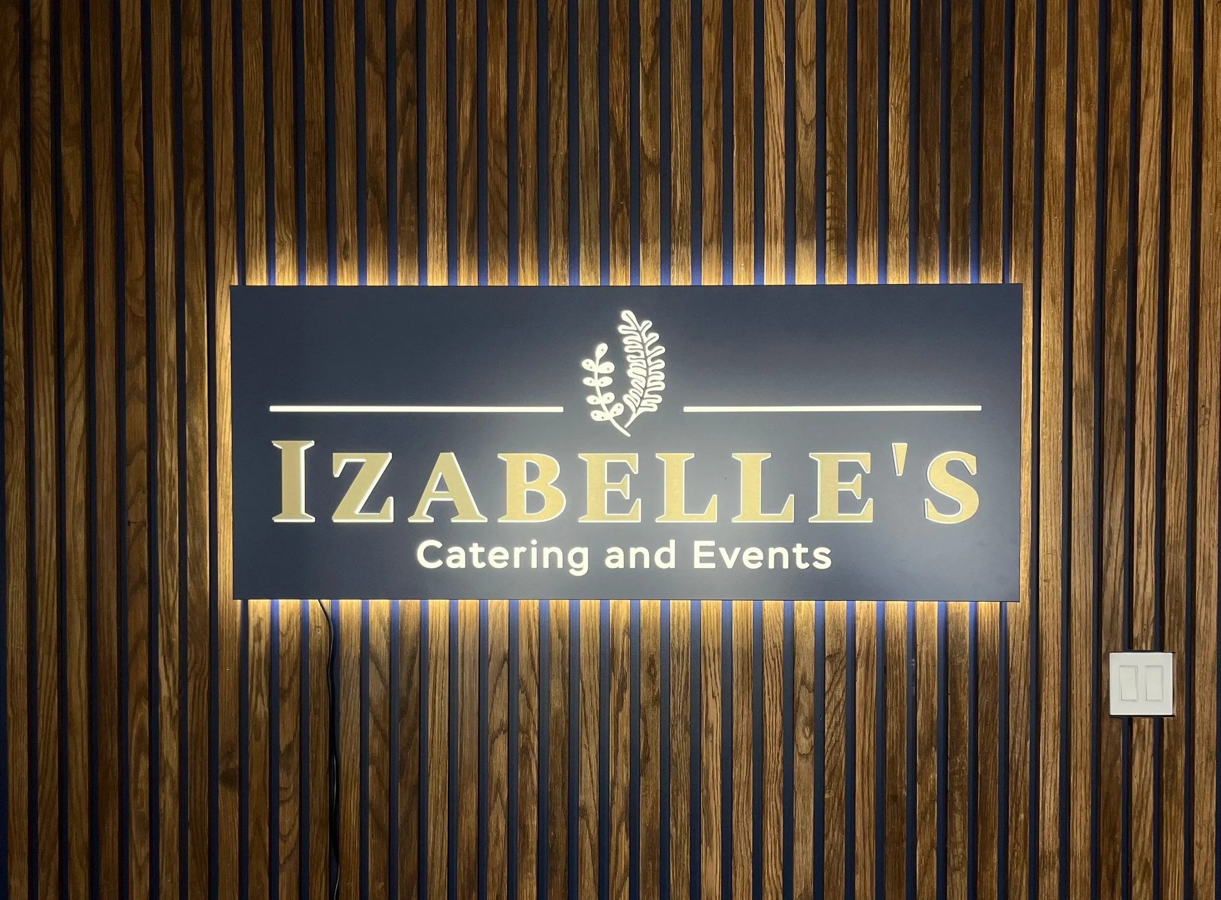
3. Wellings of Whitby: Illumination and Residential Elegance
4. W Plaza at Welches: Full-Service Branding and Wayfinding
5. One Park Lane Condominium: High-Visibility Directory
6. Classic Kitchens: Maximizing Visibility in a Retail Plaza
7. Beyond the Exterior: Environmental Graphics for CritiCall Ontario / Ornge
8. Final Thoughts and Looking Ahead to 2026
Contact us today to get started on your 2026 sign project.
Value Village: A Bold, Sustainable Statement
One of our standout projects this year involved crafting and installing the exterior signage for a major new Value Village location. This installation perfectly showcases high-impact retail branding.
The main channel letter sign, featuring the iconic red "Value Village" logo, stands out boldly against the modern, dark grey facade, ensuring maximum visibility both day and night.
We also executed the contrasting, bright green signage for the adjacent Donation Centre, clearly defining the store's two main functions. This strategic approach ensures the whole building acts as a cohesive, highly visible brand statement.
We were proud to deliver signage that is both show-stopping and energy-efficient, reinforcing Value Village's presence in the community.

Alwind Industries Ltd.: Setting the Standard with a Classic Monument Sign
For Alwind Industries Ltd., the goal was to create a professional and durable first impression right at the entrance of their facility. This monument sign perfectly achieves that.
Design Highlights: The sign features dimensional letters in their signature blue, mounted on a clean, light-grey panel, ensuring the company's branding is crisp and instantly recognizable.
A Solid Foundation: The base is clad in an attractive stacked stone veneer, blending a classic, high-quality look with modern materials. This stone foundation provides a sense of permanence and strength.
Wayfinding Integration: The sign also cleanly incorporates the address number (130) in matching blue, making it easy for visitors and deliveries to locate the building.
This project demonstrates AGC Signs' ability to combine professional aesthetics with rugged, long-lasting construction to create a true statement piece for a corporate environment.

Wellings of Whitby: Illumination and Residential Elegance
Our work for Wellings of Whitby stands out as a premier example of how professional signage defines the entrance to a modern residential property. This project utilized striking backlit channel letters to create an elegant and welcoming display.
Striking Visibility: The clean, white dimensional letters of "Wellings of Whitby" are mounted on a deep charcoal fascia, providing high contrast and ensuring the name is clearly visible against the brick facade.
The Power of Light: The sign features sophisticated backlighting, where light spills back onto the mounting surface, creating a beautiful halo effect. This detail provides 24/7 visibility and adds a touch of high-end luxury to the property entrance.
Unique Branding: The design is perfectly complemented by the custom, illuminated honeycomb graphic element, reinforcing the unique branding of the residence and adding visual warmth with its orange and yellow tones.
This sign is more than just identification; it acts as a beacon, guiding residents and visitors and setting a tone of upscale, contemporary living.

W Plaza at Welches: Full-Service Branding and Wayfinding
One of our most integrated projects this year was the complete signage package for W Plaza at Welches.

Exterior Identity: The building is instantly recognizable thanks to the large, eye-catching dimensional logo sign on the facade. The bold white "W" sits on a contrasting black panel, offering a clean, sophisticated, and highly visible anchor for the retail center.
Intuitive Guidance: Inside the plaza, we designed and installed a full suite of digital-style wayfinding directories. These signs feature a sleek black background with bright, contrasting turquoise and white text, making crucial information—like directions to Shopping, Restaurants, Cinema, and Upper/Lower Level Parking—instantly legible.
The Seamless Experience: This project is a perfect example of how cohesive, well-designed signage guides the customer from the street right to their destination, enhancing the overall visitor experience and reinforcing a high-quality brand image.
This job required both high-impact exterior branding and detailed, practical interior wayfinding, showcasing our full range of capabilities.

One Park Lane Condominium: High-Visibility Directory
Our project for One Park Lane Condominium is a prime example of how clean design and strategic lighting can simplify complex information for a residential property.
Sleek Design: This freestanding pylon sign features a modern, all-black background that makes the illuminated white text pop, providing excellent contrast and high visibility both during the day and at night.
Clear Wayfinding: The sign acts as a crucial directory, clearly displaying important information such as the name ("One Park Lane Condominium"), the multiple physical addresses (195 St. Patrick Street and 211 St. Patrick Street), and the designated visitor entrance (280 Simcoe Street).
Nighttime Impact: By using internal illumination (likely LED), the sign ensures that residents and visitors are guided effectively 24 hours a day, adding an element of security and professionalism to the property's entrance.
This sign effectively manages the logistics of a large, multi-address urban condominium, a necessity for smooth property management.

Classic Kitchens: Maximizing Visibility in a Retail Plaza
Our work for Classic Kitchens showcases effective branding within a busy commercial center. This installation utilized a layered approach to ensure all key information is delivered clearly and attractively.
Primary Branding: The main dimensional white channel letters for "Classic Kitchens" command attention, ensuring the store is easily located from a distance.
Service Subtext: Directly below, a contrasting, deep red fascia panel displays the store's primary offerings—"Kitchens • Bathrooms • Renovations"—in highly visible white lettering. This secondary panel instantly informs potential customers of the services offered.
A Professional Look: The clean design with contrasting colours (white, red, and the neutral building facade) provides a professional, appealing, and easy-to-read sign that stands out from neighbouring tenants.
This project is a testament to how combining primary branding with a clear list of services maximizes a store’s street-level marketing effectiveness.
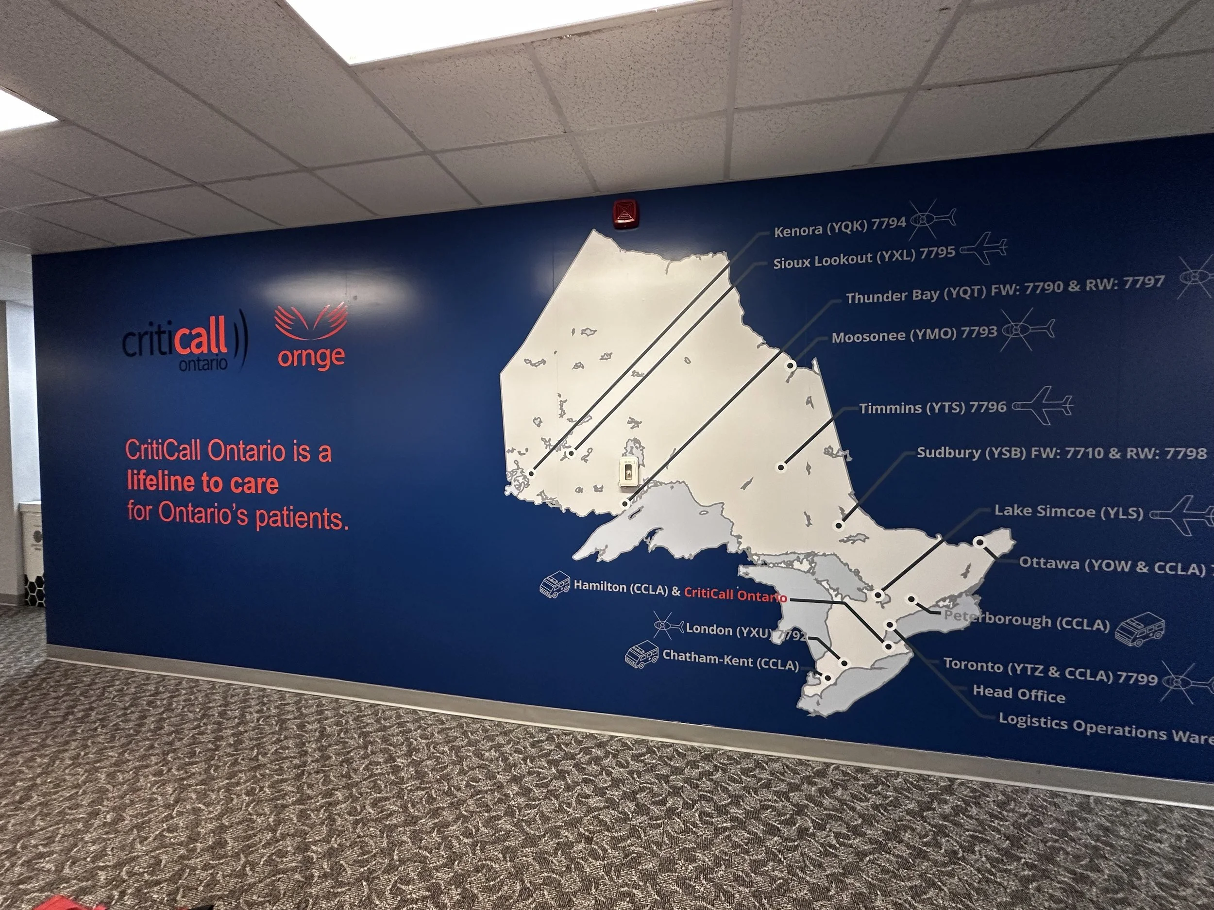
Beyond the Exterior: Environmental Graphics for CritiCall Ontario / Ornge
To cap off our 2025 recap, we are excited to highlight a project that goes beyond traditional exterior signs: large-format interior wall graphics.
This project for CritiCall Ontario and Ornge demonstrates our ability to transform internal spaces into powerful, informative, and inspiring branded environments.
Impact and Scale: These immense wall wraps feature the map of Ontario, acting as a crucial visual aid and motivational backdrop for their critical logistics operations.
A Lifeline Visualized: The graphics clearly and cleanly present the extensive network of medical transportation via Ornge, with specific details like airport codes and flight routes, reinforcing the message that they are "a lifeline to care for Ontario's patients."
Professional Finish: Utilizing high-quality vinyl and expert installation, we ensured a seamless, durable, and non-reflective finish that transforms the operations center into a dynamic and professional workspace.
This project underscores our commitment to providing comprehensive visual solutions, inside and out, that serve both a functional and inspirational purpose for our clients.
Final Thoughts and Looking Ahead to 2026
As you can see, 2025 was a year defined by variety, innovation, and client satisfaction. From ensuring clear and elegant wayfinding at the One Park Lane Condominium and the W Plaza at Welches, to delivering high-impact corporate identity at Alwind Industries Ltd. and retail visibility for Value Village and Classic Kitchens, our team brought passion and precision to every installation.
We are incredibly proud of the relationships we built and the challenging projects we executed. None of this success would be possible without the trust of our clients and the dedication of the entire AGC Signs team.
What's Next? The Future of Signage in 2026
The signage landscape is always evolving, and we are excited to lead the way in 2026. We anticipate a continued focus on the smart tech revolution, as well as:
Integrated Digital Displays: Seamlessly blending static and dynamic digital elements for maximum impact.
Sustainable Materials: Prioritizing eco-friendly, long-lasting materials and energy-efficient lighting across all projects.
Experiential Graphics: Creating immersive environmental graphics (like the large-scale wall wraps we completed this year) that transform interior spaces and reinforce company culture.
Ready to start defining your brand's presence in the new year?
AGC Signs: Outdoor Signs For Businesses

Let's Define Your Brand in 2026
Are you ready to make a visual impact as powerful as the projects highlighted in this recap?
Whether you need dynamic channel letters, elegant monument signage, or inspirational environmental graphics, the AGC Signs team is ready to partner with you.
Don't wait to start your next great project! Contact AGC Signs today.
What Our Customers Are Saying
“We had a great experience working with Adrian from AGC Signs! From design plan to installation, their team was professional, responsive, and wonderful to work with. The final product exceeded our expectations—we’re so happy with the results. Highly recommend them for any signage needs!”