Do you ever wonder what makes for great sign design? In this blog post, AGC Signs will cover the following 5 essential design tips:
Let’s look at the following tips for designing a physical sign in more detail.

Keep your marketing plan in mind when planning your sign design.
Sign Design
1. Attract Your Target Market
Before you begin designing a sign, think about who your target market is. Are you selling athletic clothing, commercial lawn services, or household goods? Ask yourself the following questions:
Who are the people buying my goods or services?
What would attract my average customers?
What sort of elements would my customers find attractive in a sign?


Notice the elements in the signs above - each sign includes some sort of graphic or colour scheme that appeals to the customers or represents their business. It’s not hard to recognize who the sign will appeal to: people who buy bulk or natural food, parents or students in need of educational support and animal lovers!
Next, see how the choice of brown in the bulk food store sign suggests that someone can buy whole foods or grains. Meanwhile, the small, red apple is a primary colour and suggests basic training.
Think critically about the following elements and whether or not they will attract or turn away your target audience:
Text & fonts
Graphics
Colours
Size
Slogans
The bottom line is, start your sign design by making sure your sign is attractive to your target market.
2. Choose High Contrast Colours

We just love the physiotherapy sign featured above given its high colour contrast. The designer has used colour theory to their advantage. We know this because the touch of yellow in the corner is a complementary colour to blue. Together, the logo and the white lettering pop with this background. It is easy to read and the clever use of lines and circles hints that your body may just be better aligned after a visit to the office!
Ok, so maybe that was too much information on why we love this sign! Keep reading and we’ll summarize why high-contrast colours are important for a good sign design.

Why high contrast colours are important in sign design:
Signs are easier to read
Text & graphics stand out more
They are appealing to the natural eye
Try to think about some of your favourite signs - chances are they employ high-contrast colours.
3. Keep it High
Sometimes a sign gets lost in its surroundings. We recommend building signs that stand above surrounding foliage so that trees and plants don’t block someone’s view of it, whether they are approaching your sign by car or foot.
You can see that the sign in the image above is on a bit of a hill and between two large trees so that it is visible from the road. Even still, the greenery below needs to be trimmed so it doesn’t disappear over time!
Also, remember that drivers who are searching for their destination will not have long to see a sign. They need to see your sign at a quick moment’s glance instead of having to crank their neck around shrubs and foliage to see if they are indeed in the right location.
On the other hand, the height of your sign may depend somewhat on your target market. For example, if you are a business located along a highway and you are targeting travellers who are hungry, you might need a pylon sign, similar to McDonald’s and those tall golden arches.
4. Keep it Visible
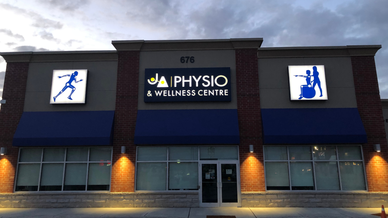
You may have thought we covered this already in the last section, but this next point is more about keeping your sign visible at night. Have a look at our physiotherapy sign again and notice how the white lettering stands out at night.
Whether you choose backlit signs, neon signs or lightbox signs, consider how a sign can keep your brand present in people’s minds whether it is day or night.
5. Make it unique

Besides standing out physically, you’ll want to try and design your sign to be unique and stand out in people’s memory. The sign above takes a classic salon symbol such as a pair of scissors or barber shears and blends it into the text of the business name. It is a unique way of incorporating something that would be otherwise standard. Another unique feature of this sign is the use of “z” instead of “s” to make the word icon plural.
While it isn’t always possible and you don’t want to be so unique that people are left confused, here are some ways to make your sign unique:
A twist or play on words (or letters as in the case above)
Unique fonts
Have fun with this step of sign design and make your sign uniquely yours! Or, if this step does not align with your skillset, trust the professionals at AGC.

AGC can make your design life easier by helping with your next project!
AGC Signs: Your Sign Design Specialists
For over 10 years, AGC Signs has been in the business of sign design. They understand how to create signs that make an impression!
We hope that we have helped you with these essential sign design tips. However, with so many factors to consider, our team of experts can help make the task of sign design even easier by helping you design your next project. We will help you build your brand and display it effectively.
Our design staff will also help you with:
Structural requirements
Municipal by-law requirements
Architectural features of your building
For professional results that make a lasting impression, contact our knowledgeable sign experts at AGC Signs.
Testimonials
“We reached out to Adrian and Rhonda for signage for our new clinic, and they were amazing. We sent over our design and swiftly received a quote and mock-up. They provided excellent customer service and clear communication, high quality work including installation, with a fast turn around time. All during the Holiday season I might add! We will be reaching out to them for all our signage needs and have already recommended them to friends. 5 stars!”
“Adrian and his team are very professional, reliable and easy to work with. AGC has made two signage for me already for two different store fronts. I love both of them! Highly recommended!”


