Are you unsure about how to create effective office signs? In this article we will discuss some of the best practices when it comes to designing the perfect one for your business, such as messaging, spacing fonts and more!
We'll provide you with helpful tips and tricks that will enable you to design the perfect office signs for your business.
Feel free to jump ahead to each section by clicking on the links below.
At AGC, we have over ten years of experience designing, manufacturing, installing and maintaining custom office signs in the Durham region. Contact us now to learn how we can make your business stand out!
Make sure your office signs portray the right message for your business.
Office Signs: Best Practices
Here are some best practices that will make your office signs much more effective and give your customers or clients the best experience possible when visiting your facility.
1. 5 Second Or Less
Keep your message short. If one of your office signs takes longer than 5 seconds to read, then it is most likely too long. Find a way to shorten it. Clear and concise information is very important so that you can portray the message that you want to in as few words as possible.

Viewers should be able to read your sign in 5 seconds or less
2. Use the Correct Spacing
Proper measuring is vital when it comes to making up any type of sign, including office signs. If you are using individual channel letters then you need to be particularly careful to get your spacing right. A sign will look awful if you start to run out of room and your lettering has to be closer together to make up for it.
You might wonder how spacing can matter so much, but it really does. A viewer will immediately notice that your sign looks odd even though they may not be able to say exactly why. Be careful with your spacing.

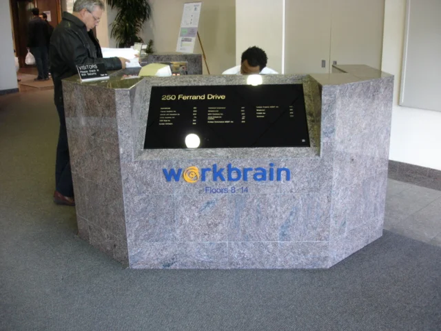
Your office sign should be easy for the viewer to read.
Proper spacing is not a simple matter of leaving the same amount of space between the letters. For example, the letter "W" can be spaced much closer to the letter "A" than the letter "L". The is because of the angle of the last line in the letter "W" and the first line in the letter "A".
The lines are parallel so they can be closer together. The letter "L," on the other hand, has vertical lines so it can't nestle up to the "A" they way a "W' can.
If you are installing your own office signs, you can use a paper template that you can lightly trace onto your wall with a pencil to help you get your spacing and alignment correct.
If you want to make sure that it is perfect, hire a professional to install your office signs for you. A professional sign company has the experience and the knowledge to manufacture and install your office signs with the proper spacing.

Make sure your letters are properly spaced.
3. Choose an Easy-to-Read Font
It's best to choose one of the classic, tried and tested, easy-to-read fonts to make sure that your viewers are able to read it. A sign is absolutely no good if people have trouble reading it.
Even if your business has an elegant or whimsical culture, don't be tempted to choose a font that is so swirly or wacky that the words are illegible. If you are unsure about what font to choose, get help from professionals.

Make the letters on your sign 1” for every 10’ of distance
4. Make Sure Your Letters Are Visible
You need to make sure that the size of lettering you use in your sign is large enough to be seen at the viewing distance you intend. There is a general rule that, for the optimal readability, you should make your letters 1" in height for every 10 feet of distance.
Even if your letters are not the optimal height for readability, they should be at least the minimum height. If they are smaller, no one will be able to read them and your sign will be a poor use of your money. You can use the handy calculator here to find out what are the minimum and recommended sizes for readability.
For example, if you want to put up a sign that your viewers will be looking at from 30 feet away, then the minimum height that they can be to be read at all is 1 inch, however, 3 inches is the recommended size for optimal readability.

The letters on your sign should be clear and easy for your customers and clients to read.
5. Make the Information Easy to Understand
If you are creating departmental, directional, organizational, or wayfinding signage, keep in mind your goal is to help people to get around. These types of office signs need to be short, simple, and to the point. It is also best to use large, bold fonts for easy reading.
Test out these types of signs on someone who is not from your office before you have them made up to see if they are easy and clear enough to understand.

Your wayfaring office signs should be make it easy to navigate your space.
6. Accessibility Signage Tips

Install braille signage within an easy arm’s reach.
If you want to do all you can to make sure that all of your customers feel welcome, you may want to add appropriate accessibility signage in your office parking lot, at your entrances and exits, in your restrooms, and near your elevators.
If you install signage with braille, make sure that it is installed within an easy arm's reach, no more than 40-60" from the ground and with no physical barriers in front of it.
To learn more about accessibility signage requirements in Ontario, click here.

Remember: Effective office signs are clear, concise, and easy to find. Keep the message short and use large, easy-to-read fonts.
Consider contrasting colours for better visibility and ensure the sign is visible, especially for directional or safety signage.
And finally, use professional materials that complement your office's overall aesthetic.
Office Signs: Get the Best from the Best - AGC Signs

If you need custom office signs that will get your message across, contact the office signs pros at AGC. We have over 10 years of experience in the signage industry in Ontario.
We strive to exceed industry standards by providing our clients with superior signage solutions through in-house custom design, fabrication, and installation.
All of our technicians are highly skilled and extremely hard-working and we use only top-of-the-line equipment. Contact us today for a free quote.
What our customers are saying
"Very happy with customer service provided for my business. Fast service from skilled individuals who perform a wide variety of jobs related to my graphic and printing needs. Would gladly recommend."
- Mark Tiano


