Signage design plays a critical role in how your brand is perceived and how effectively your message reaches customers.
Whether you're creating storefront signs, wayfinding signage, or promotional banners, a well-designed sign can boost foot traffic, enhance brand visibility, and drive conversions.
On the flip side, poor signage design can confuse customers and waste marketing dollars.
In this post, we’ll explore signage design best practices to help you avoid costly mistakes and create clear, compelling, and professional signs.
Here are some best practices to keep in mind:
Ready to attract new customers with amazing signage design? AGC Signs, with over a decade of experience, is a trusted industry leader known for crafting high-quality, impactful signs. Contact us today!
1. Start With a Clear Layout
The layout is the foundation of effective signage design.
If your layout is cluttered or disorganized, even the most compelling message will get lost in the noise.
Best Practices:
Define a visual hierarchy: Your main message or CTA should be the largest and most prominent element. Secondary information (e.g., website, phone number) should be smaller and positioned accordingly.
Follow the Z-pattern: Most people scan from top left to bottom right. Place important elements along this path to ensure they get noticed.
Balance text and imagery: Use images sparingly and only when they support the message. Overloading a sign with visuals can be distracting and reduce clarity.
Embrace white space: Don’t be afraid of empty space. It helps focus attention and makes your message more digestible.
A clean, organized layout makes your sign more visually appealing and easier to understand at a glance.
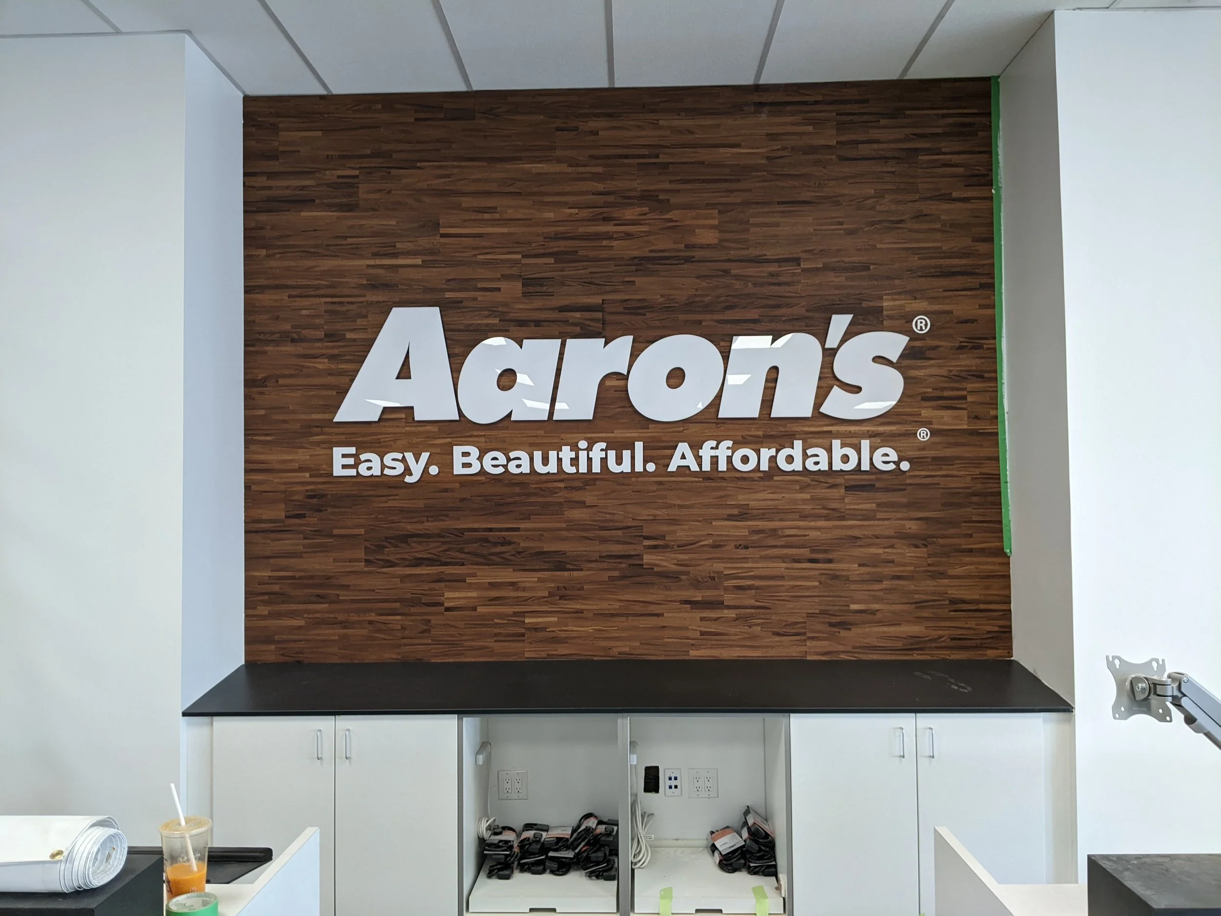
2. Ensure Maximum Readability

Even the most beautiful signage design fails if people can’t read it. Legibility is especially crucial for signs meant to be seen from a distance or while in motion—like those on storefronts or vehicles.
Best Practices:
Use sans-serif fonts: Fonts like Arial, Helvetica, and Futura are clean and easy to read, especially from a distance.
Mind your font size: A general rule is 1 inch of letter height for every 10 feet of viewing distance. For example, if your sign needs to be readable from 100 feet away, use 10-inch letters.
Limit font styles: Use no more than two font types per sign to avoid visual clutter.
Avoid stylized or script fonts: These may look elegant up close but quickly become unreadable at a distance.
Remember, your sign should communicate in seconds—if not instantly.
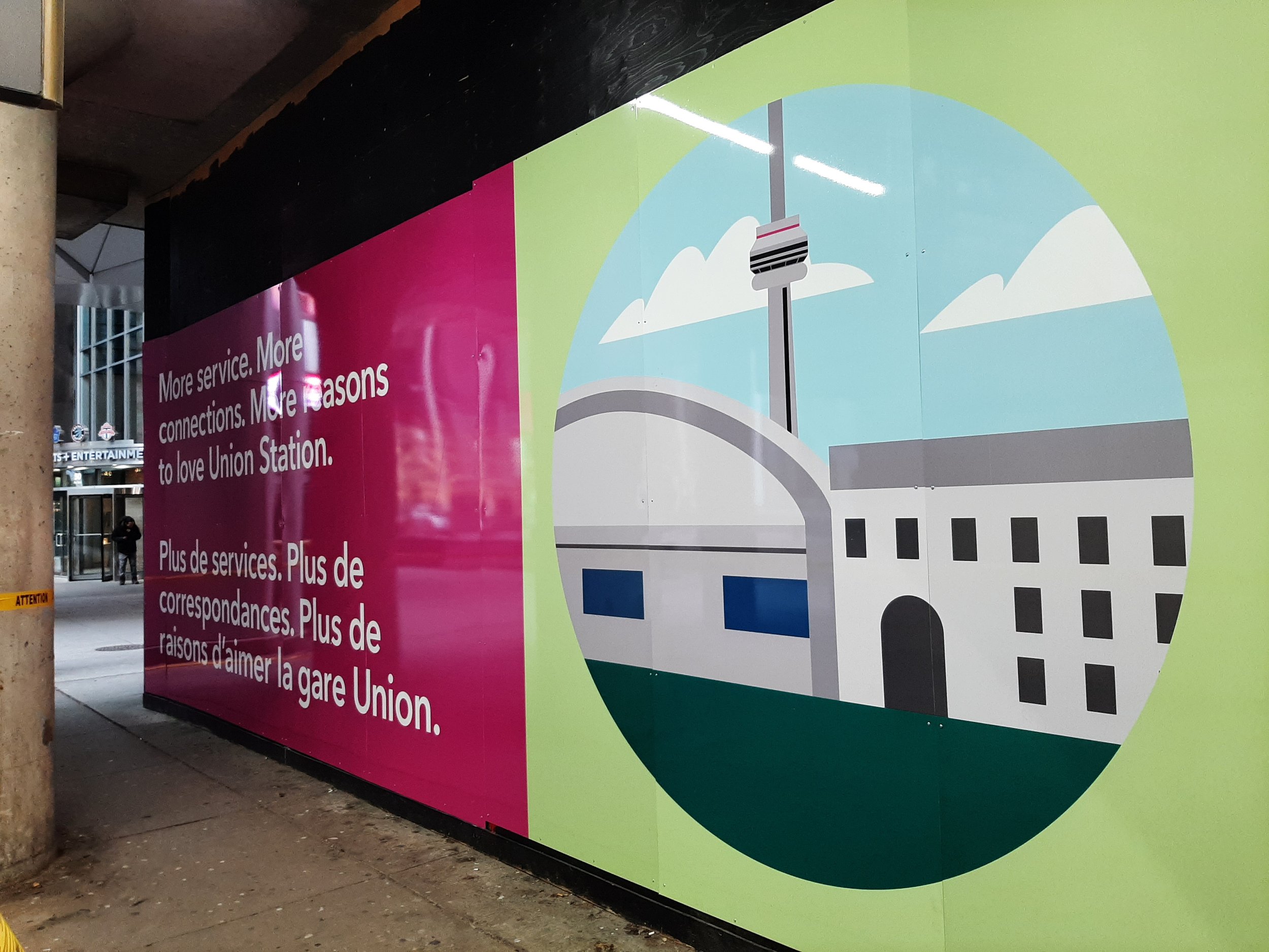
3. Use Color Contrast Wisely

Color is a critical element in signage design. It affects visibility, readability, and emotional response.
The right color combinations can draw attention and create impact, while poor choices can make your signage blend into the background or become unreadable.
Best Practices:
Maximize contrast: Light text on a dark background (and vice versa) offers the highest legibility. Black and white is the gold standard for contrast.
Use complementary colors: Colors opposite each other on the color wheel (like blue and orange) create strong visual interest.
Avoid clashing or low-contrast pairs: For example, red text on a green background is both difficult to read and visually unpleasant.
Stay on-brand: Use your brand colors thoughtfully, but adjust shade or brightness if necessary to maintain readability.
A well-chosen color palette not only improves readability but also reinforces brand recognition.
4. Maintain Branding Consistency
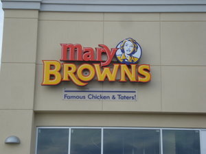
Consistency across all your signage helps establish trust and reinforces your brand identity.
If each sign looks different, customers may feel disconnected or confused about your business.
Best Practices:
Use your brand’s fonts and colors: Stick to your established brand style guide whenever possible.
Include your logo: Make sure it's placed consistently across all signs—either in the top left, top center, or bottom right for best visibility.
Keep the messaging tone uniform: Whether you're being friendly, professional, or quirky, make sure the tone of your signage matches the tone of your brand.
Apply consistent sizing and spacing: Especially if signs are part of a series (e.g., directional signage or promotional displays), consistency is key to maintaining a professional appearance.
Consistency in signage design shows that your business is reliable and detail-oriented.
5. Before & After Example: Poor vs. Great Signage Design
Let’s look at a visual example to understand how these principles come together.
Below is a comparison of a poorly designed sign and a well-optimized one.


Before – Poor Design:
Multiple fonts and inconsistent spacing
Low contrast: red text on a black background
No clear focal point or message hierarchy
Branding elements are missing or unclear
After – Great Design:
Clean layout with clear visual hierarchy
Bold, easy-to-read font with excellent color contrast
Prominent CTA and business name
Branding is consistent and visible
By applying these signage design best practices - from layout and legibility to color contrast and branding - you’ll increase your visibility, attract more customers, and present a polished image that reflects the quality of your business.

ASK FOR A Free SIGNAGE Design Consultation
Don’t risk your signage falling flat. Work with our expert designers to ensure your signs are clear, professional, and perfectly aligned with your brand.
👉 Request Your Free Signage Design Consultation 👈
Let us help you make a lasting impression with signage that works.
“We had a great experience working with Adrian from AGC Signs! From design plan to installation, their team was professional, responsive, and wonderful to work with. The final product exceeded our expectations—we’re so happy with the results. Highly recommend them for any signage needs!”


