The first impression of a business isn’t made at the cash register or in a boardroom; it happens at the curb. Your signage is a 24/7 brand ambassador, yet many businesses fall into the trap of visual clutter, trying to say too much, too small, and in too many colours.
To convert a passerby into a customer, your sign delivers a message in the blink of an eye. Here is how to refine your signage strategy into a high-impact asset.
AGC Signs can help with everything from sign design ideas to installation. Contact us today to get started with your project.
Key Takeaways
Visibility First: Use high-contrast colour pairings to ensure the sign is readable in all lighting.
Prioritize Clarity: Stick to clean, bold Sans-Serif fonts and avoid script or decorative styles.
Embrace the Void: Use ample white space to prevent clutter and guide the eye.
Calculate Scale: Size your letters based on how far away your audience will be.
Simplify the Message: Aim for a 3-second comprehension time.
1. Mastering Visual Contrast
Contrast is the engine of legibility. Without it, even the most beautiful logo remains invisible. When choosing colours, you aren't just looking for "pretty" combinations; you are looking for luminance difference.
The 70% Rule
Aim for at least a 70% brightness difference between your background and your text.
Beyond Black and White
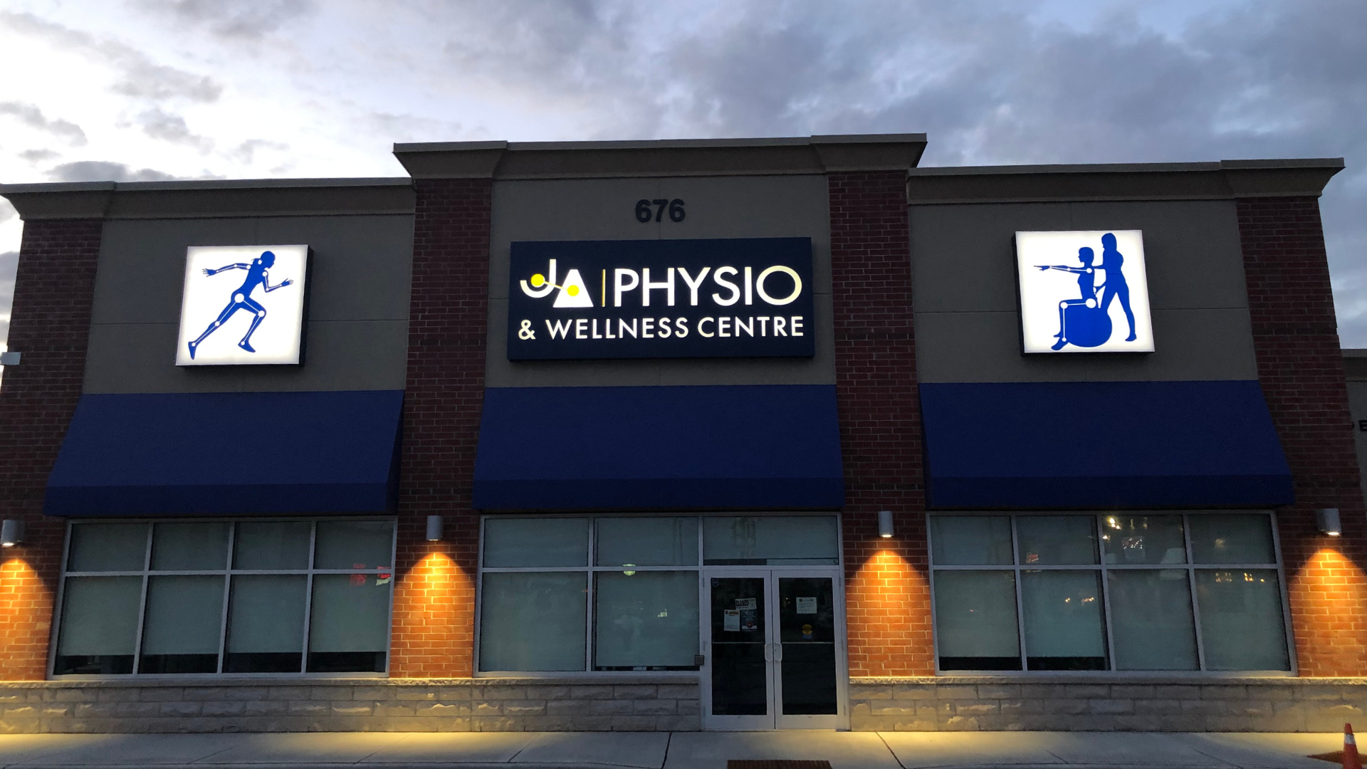
While black-on-white is the gold standard, other high-impact pairings include navy on white, white on forest green, or black on yellow (the highest-visibility combo for moving traffic).
Avoid "Vibration"
Never pair colours with similar saturation, such as red text on a blue background. These colours "fight" for the eye’s attention, creating a blurry, vibrating effect that causes eye strain and reduces reading speed.
2. Typography for Speed and Distance
On a sign, a font’s job is to be invisible—meaning the reader should process the word without having to decode the letter.
San-Serif Dominance
For outdoor signage, Sans-Serif fonts (like Montserrat or Helvetica) are superior because they lack the small decorative "feet" (serifs) that can blur together at a distance or under low light.
Kerning and Tracking
Ensure your letters aren't touching. "Tight" letter spacing might look modern on a business card, but from 50 feet away, a "cl" can easily look like a "d."
Case Sensitivity
Use Title Case (Upper and Lower Case) for long names. Research shows the human brain recognizes the unique shapes of lowercase letters faster than a block of ALL CAPS, which the eye perceives as a simple rectangle.
3. The Architecture of Negative Space
The biggest enemy of a good sign is the "everything but the kitchen sink" approach. If you try to highlight everything, you highlight nothing.
The 40% Rule
At least 40% of your sign's surface area should be "white space" (empty space). This isn't wasted room; it is a visual funnel that forces the viewer's eye toward your primary message.
Edit Ruthlessly
If your sign has your name, your logo, your phone number, your website, your slogan, and a list of five services—it’s a brochure, not a sign. Pick the one thing you want them to remember.
One Secondary Element
If you must include more than your name, limit it to one secondary element, like a phone number or a "Call to Action" (e.g., "Park in Rear").
4. Scaling for the Human Eye
Size is a functional requirement, not a design preference. You must design based on the Viewer’s Velocity.
Pedestrian vs. Driver
A pedestrian walking at 3 mph has time to read a smaller sign. A driver moving at 40 mph needs letters that are massive and a message that is minimal.
The Height Formula
Every 1 inch of letter height provides roughly 10 feet of readable distance. For a sign meant to be read from a car 100 feet away, your letters need to be at least 10 inches tall.
Check our Sign Letter Height Calculator for guidance.
Resolution and Assets
Ensure your logo is a vector file (.svg or .eps). Scaling up a small .jpg will result in pixelation (jagged edges), which subconsciously signals a lack of professionalism to potential customers.
5. Industry-Specific Quick Fixes
While the core principles of design remain constant, the specific challenges of a storefront or service vehicle vary by sector; here is how different industries can apply high-impact changes with minimal effort
| Industry | The Problem | The Simple Fix |
|---|---|---|
| Retail/Boutique | Visual "noise" from too many window stickers and decals. | Remove 80% of window decals; use one high-contrast A-frame sign with 3 words max. |
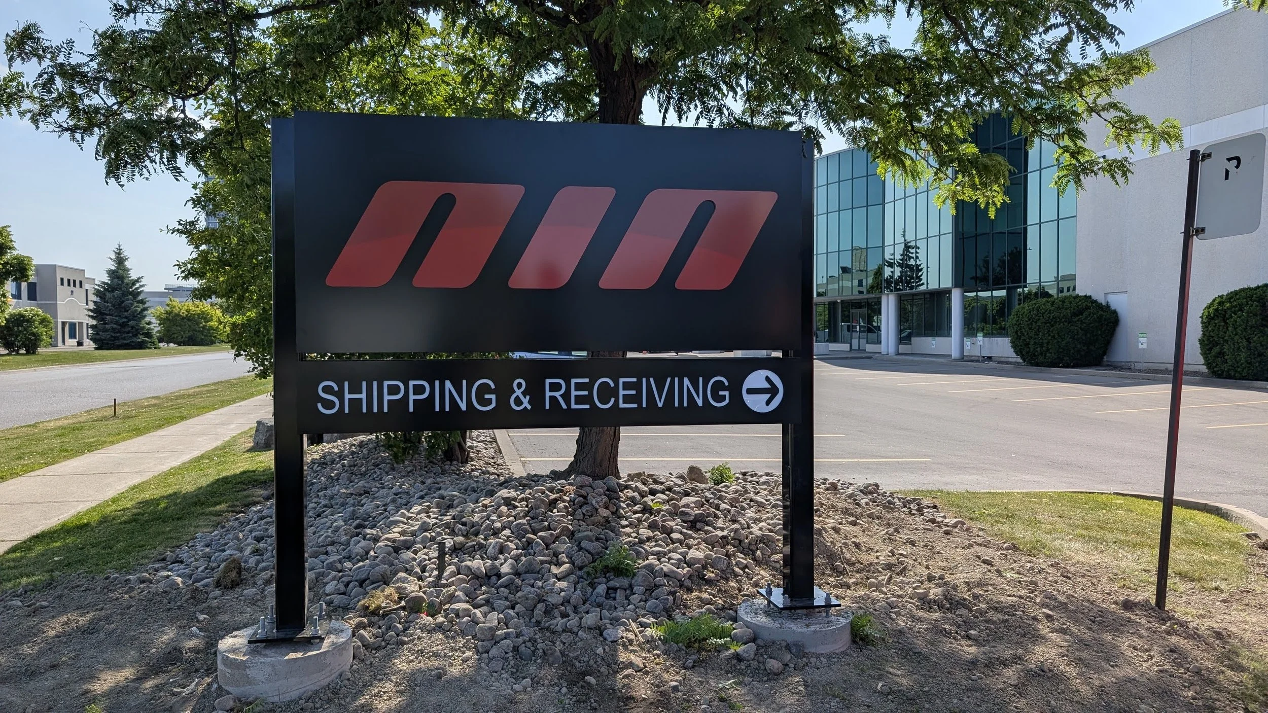
| Trade Services | Complex logos that get lost on truck wraps or site signs. | Simplify the logo to a bold icon and ensure the phone number is the highest-contrast element. |
| Healthcare | Overly clinical, "cold" or hard-to-read signage. | Use softer, high-contrast blues or greens with rounded Sans-Serif fonts to appear approachable. |
| Manufacturing | Small, hard-to-find entrance signs for vendors and staff. | Use "Wayfinding" colors (Safety Yellow or Bright Blue) to clearly guide visitors to the main door. |

THE AGC DIFFERENCE:
FROM SIGN DESIGN IDEAS TO INSTALLATION
Ready to transform your brand’s first impression from a whisper to a shout? Audit your current signage today. Walk across the street or drive past your location at normal speed - if you can’t digest your message in under three seconds, it’s time for a refresh.
Don't let poor design be the barrier between you and your next customer. Start by simplifying your most visible sign using the high-contrast and minimal-wording techniques outlined above, and watch how much more effectively you capture the attention of everyone passing by.
“Adrian and AGC Signs team have been great to deal with and we are very happy with our sign! The whole process was very quick and our sign was designed and lit up in a very short time frame. If you’re looking for a quick, professional solution for your sign AGC Signs is the way to go!”


