Effective business signage isn't just decoration - it is one of the highest-ROI marketing investments a brick-and-mortar location can make, directly influencing whether passing motorists become paying customers.
In this post, we will take a look at studies that have been done on signage techniques that actually lead to more traffic for your business:
Contact AGC Signs today to discuss your business sign ideas and to get a free quite on your next project.
Key Takeaways
First Impressions Dictate Foot Traffic: Over 76% of consumers enter a business they’ve never visited before based purely on its signage, while 68% link a sign's quality to the products inside.
Design for Drivers & Distance: Signage mounted perpendicular to traffic requires 70% less surface area to achieve the same readability as parallel-mounted signs. Text size must follow a minimum standard of 1 inch per 25 feet of distance.
Maintain Visual Integrity: Poorly maintained or outdated signage actively drives customers away—nearly 60% of consumers avoid businesses with broken or misspelled signs.
Clarity Outperforms Complexity: High-contrast text, clear typography, and generous white space allow motorists to process messaging within 1 to 2 seconds at road speeds.
1. Prioritize Font Size and Readability Distance
A sign cannot convert a passerby into a customer if it cannot be read in time.
Vehicle speed directly reduces a driver's field of vision and processing window. If typography is too small or stylized, drivers will bypass your business before they can react.
The Science Behind It
Research compiled by the United States Sign Council (USSC) establishes the Legibility Index (LI), which dictates letter height relative to speed and distance. Industry standards recommend a minimum letter height of 1 inch for every 25 feet of viewing distance.
For a storefront viewed from 100 feet away by traffic moving at 35 mph, primary lettering needs to be at least 4 to 6 inches tall to ensure safe reaction times.
Rule of Thumb: Stick to clean, sans-serif fonts with even stroke widths. Script or decorative typefaces drastically reduce legibility at speed. Check out our business sign letter height calculator for more help with this.
2. Mount Perpendicular to Oncoming Traffic
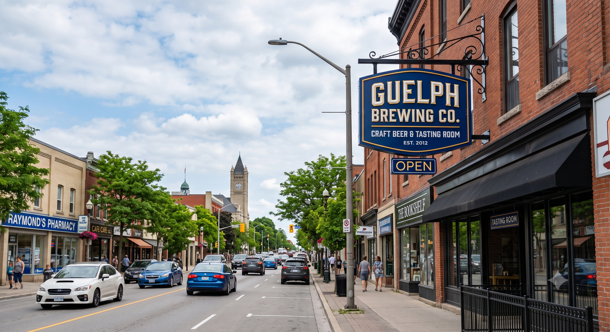
Storefront signs mounted flat against a building wall (parallel to the road) are virtually invisible to drivers travelling in either direction until they are directly alongside the property.
The Science Behind It
Studies highlighted by the International Sign Association (ISA) reveal that signs mounted parallel to the roadway must be at least 70% larger than perpendicular signs (like pylon, monument, or projecting blade signs) to achieve the same visual impact and reaction window.
Perpendicular placement aligns directly with a driver’s natural cone of vision, giving them the necessary distance to read, decide, and safely pull into your lot.
3. Embrace Simplicity and High-Contrast Design
When designing signage, creativity should never come at the expense of clarity. Passing motorists have approximately 1.5 to 2 seconds to absorb your sign's message.
The Science Behind It
Research published in the Signage Readability Guide demonstrates that visual contrast is the single most important factor in rapid comprehension. High-contrast combinations - such as black text on yellow, dark blue on white, or white on black - stand out across changing light conditions.
Furthermore, keeping 30% to 40% of the sign face as open white space prevents visual clutter and allows the core brand name to stand out immediately.
4. Ensure Flawless Maintenance and Modern Aesthetics
Your exterior sign is often the very first touchpoint a prospective buyer encounters. Outdated, weathered, or broken signage projects neglect and low quality onto the business itself.
The Science Behind It
A national study conducted by FedEx Office and Ketchum Global Research found that 68% of consumers believe a store's signage reflects the overall quality of its products and services.
Additionally, over 50% of respondents noted that poor, misspelled, or damaged signs deterred them from entering a storefront. Regular maintenance and modern materials directly protect your store traffic.
5. Incorporate Proper 24/7 Illumination
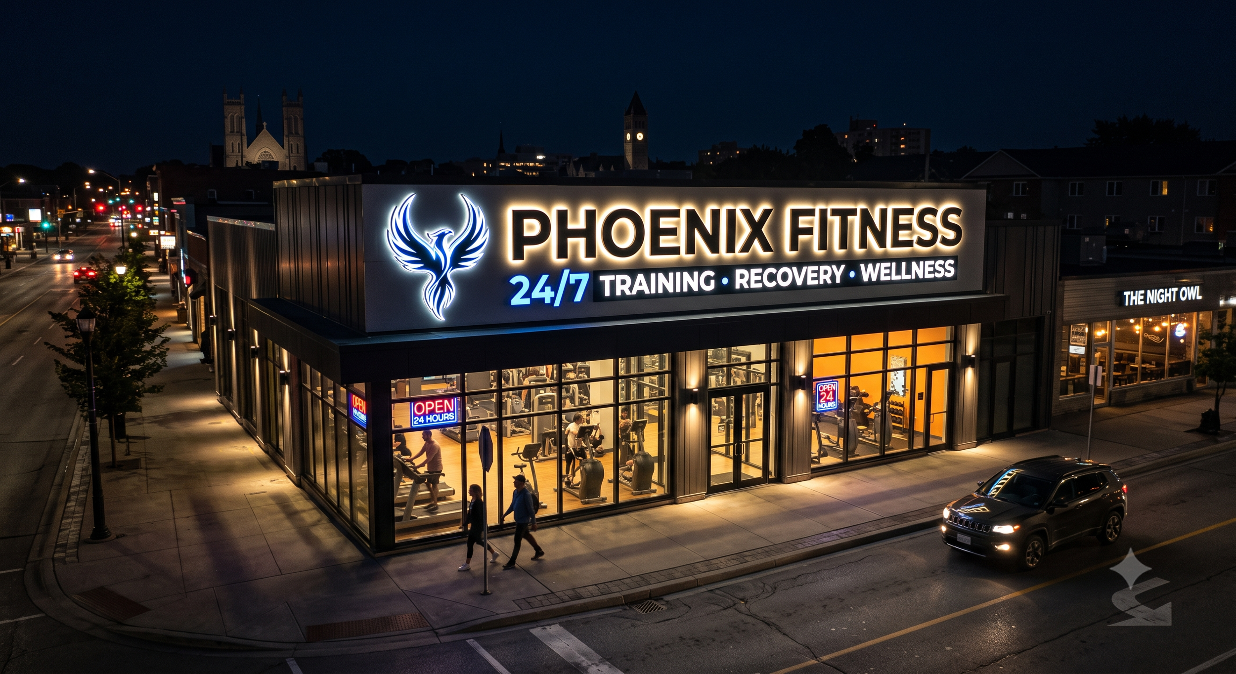
Your business sign should continue generating impressions long after business hours end. Unlit signs vanish at dusk, squandering valuable advertising time to night-time commuters.
The Science Behind It
Economic studies from the Sign Research Foundation (SRF) show that adding internal illumination (such as LED channel letters or backlit cabinets) yields a measurable boost in sales, particularly for businesses open during evening hours like restaurants, grocery stores, and retail centres.
Proper illumination maintains consistent contrast against dark backgrounds and ensures 24/7 brand recall.
6. Standardize Brand Elements and Distinctive Logos
Consistency breeds trust. If your street sign uses a different font, logo, or colour scheme than your website or interior branding, it creates cognitive dissonance for first-time visitors.
The Science Behind It
Research by Dr. James Kellaris at the University of Cincinnati’s Lindner College of Business highlights how standardized brand elements help consumers store your visual identity in long-term memory.
A distinct, repeated logo speeds up brand recognition on busy commercial corridors, allowing customers to spot your location from further away.
7. Optimize Wayfinding and Directional Signage
Getting a customer's attention from the main road is only half the battle. If parking entrances, door locations, or pick-up windows aren't clearly marked, prospective buyers often abandon the trip due to minor frustration.
The Science Behind It
Urban planning research featured in the International Journal of Research emphasizes that seamless wayfinding directly increases visitor retention and foot traffic.
Testing your directional signs from a visitor's perspective eliminates navigation friction, ensuring that driver interest converts smoothly into an in-store visit.
8. Leverage Digital Variable Messaging for Impulse Buys
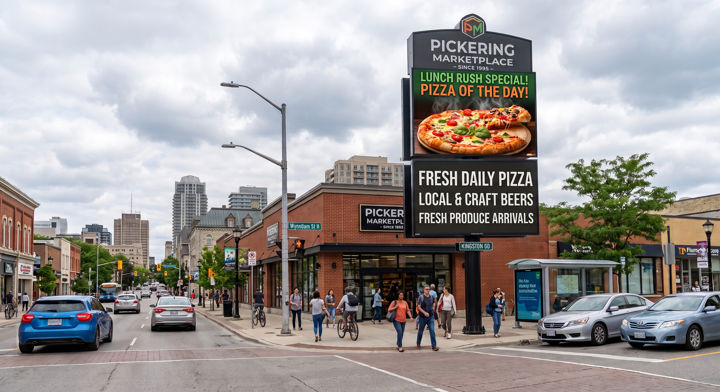
Static signs communicate who you are; dynamic digital message centres (EMCs) communicate what you are offering right now.
The Science Behind It
Data provided by the U.S. Small Business Administration (SBA) indicates that between 20% and 45% of retail purchases are impulse buys made by drivers who had not planned to stop.
Studies on dynamic electronic displays show that businesses updating time-sensitive deals, seasonal specials, or community updates experience sales lift increases ranging from 15% to over 150%.
9. Eliminate Visual Background Clutter
Even a massive sign can fail if it blends into a cluttered environment—such as brick backgrounds, busy window displays, or competing foliage.
The Science Behind It
The Signage Readability Guide emphasizes that background interference degrades text processing speed. Placing primary lettering over busy textures or un-blurred photography reduces readable contrast.
Utilizing solid backing panels or neutral raceways behind channel letters keeps the typography separated from the building facade, maximizing visual pop.
10. Deploy Multiple Strategic Sign Types
Relying on a single wall sign limits your exposure to different customer touchpoints. A complete sign strategy utilizes a mix of primary street identity, architectural accents, and window graphics.
The Science Behind It
According to the FedEx Office Signage Survey, the average consumer expects a professional small business to have two to three distinct signs around its perimeter (e.g., a monument sign at the road, a blade sign over the sidewalk, and entrance window decals).
Studies from the University of California, Berkeley further show that layered signage drives both major planned trips and unplanned impulse stops by maintaining visibility at every approach angle.
Ready to Upgrade Your Business Signage?
Your signage is working for you 24 hours a day, 7 days a week - make sure it’s driving the results your business deserves. Whether you need to update an outdated display, design high-impact LED channel letters, or install a dynamic electronic message centre that captures impulse traffic, AGC Signs is here to help.
With decades of experience crafting custom, high-visibility business signage solutions, our expert team handles everything from initial concept and local permit approvals to professional installation and maintenance.
Transform your storefront and turn passing traffic into loyal customers today.
Come Talk To Us : 860 Brock Rd #8, Pickering, ON L1W 3X3
Give Us a Call: (905) 492-2484
Reach Out Via Email: info@agcsigns.com
“We reached out to Adrian and Rhonda for signage for our new clinic, and they were amazing. We sent over our design and swiftly received a quote and mock-up. They provided excellent customer service and clear communication, high quality work including installation, with a fast turn around time. All during the Holiday season I might add! We will be reaching out to them for all our signage needs and have already recommended them to friends. 5 stars!”


