When designing commercial signage, it is easy to focus strictly on branding—your logo, brand colours, and typography. However, one of the most critical factors in sign effectiveness is often overlooked: the physical environment surrounding your business.
A sign that looks striking on a computer mockup might end up obscured by landscaping, dwarfed by a wide setback, or jarringly out of place in a serene setting. Matching your signage to your physical landscape, property layout, and location ensures high visibility, local compliance, and maximum aesthetic appeal.
Here is how to match your location to the right sign to make sure your investment delivers maximum impact.
Suburban Schools & Institutional Grounds: Short & Non-Obstructive
High-Density Urban Streets: Bold Channel Letters & Storefront Impact
Used Car Lots & High-Traffic Hubs: Maximum Height & Excitement
Ready to match your location to the right sign? Contact the team at AGC Signs today for a free consultation and quote.
Key Takeaways
Site First, Design Second: Always analyze speed limits, foliage growth, and property setbacks before selecting sign height and style.
Respect the Setting: Natural spaces require organic textures like wood or stone, while high-density commercial strips demand high-contrast illumination.
Prioritize Safety: Institutional and school signage should focus on clear sightlines for drivers and pedestrians.
Plan for All Seasons: Factor in how summer tree canopies, winter snow drifts, or changing brush line heights will impact year-round visibility.
1. Natural Landscapes & Parks: Blending Form and Function
For parks, nature reserves, recreational facilities, and environmentally integrated properties, signage should complement the natural surroundings rather than clash with them.
Recommended Style: Carved or rustic wood signs, stone monuments, or wood-grain textured composite materials.
Colours & Finish: Earthy tones (browns, greens, muted neutrals) and matte finishes.
Why It Works: High-gloss, neon, or hyper-vibrant illuminated plastic signs can feel disruptive in natural environments. High-quality wooden or carved signs communicate quality while respecting the natural landscape.
2. Large Lawns & Suburban Campuses: Low-Key Integration
If your building sits back from the road behind a wide, landscaped lawn - such as a corporate campus, church, or community centre - the goal is to establish presence without overwhelming the green space.
Recommended Style: Low-profile monument signs integrated with stonework or brick bases.
Placement & Design: Positioning the monument near the primary drive entrance keeps it readable for drivers while allowing the sign base to blend into garden beds or turf.
Why It Works: Monument signs grounded near eye level feel permanent and cohesive on expansive lawns, whereas oversized pylon signs can disrupt the estate-like appearance of the property.
3. Suburban Schools & Institutional Grounds: Short & Non-Obstructive
Schools, daycare facilities, and municipal buildings require high readability for visitors and traffic, but safety and neighbourhood character come first.
Recommended Style: Low-height, ground-mounted monument signs with built-in digital LED message centres.
Key Considerations: Keep sightlines clear near pedestrian crosswalks, drop-off lanes, and intersections.
Why It Works: A shorter sign prevents sightline obstruction for bus drivers, parents, and young pedestrians, while an integrated LED screen provides a clean, adaptable space for announcements without cluttering the lawn with temporary banners.

4. Rural Roads & Heavy Shrubbery: Reaching Above the Obstacles
Rural commercial properties, country markets, nurseries, and roadside operations often face physical challenges like high-speed passing traffic, mature trees, dense brush, or rolling topography.
Recommended Style: High-standing pylon signs or elevated post-and-panel systems.
Key Considerations: Measure tree canopy growth and setback distances from the roadway before determining final height.
Why It Works: If overgrown foliage or elevation changes block line-of-sight from 100 meters away, a low ground sign is essentially invisible. Elevating the sign above brush line gives passing drivers ample time to react and turn in safely.
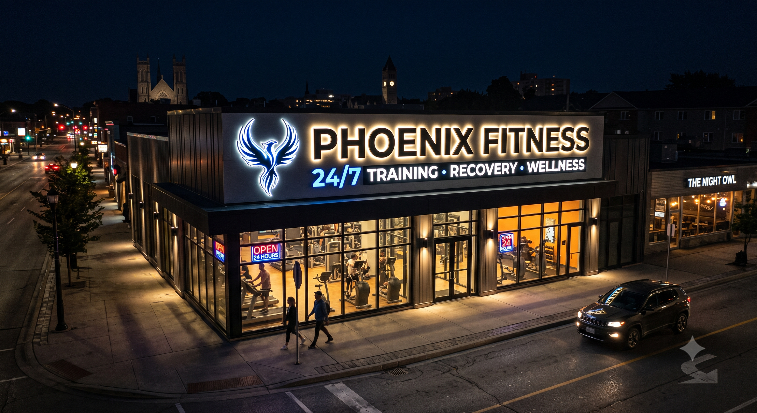
5. High-Density Urban Streets: Bold Channel Letters & Storefront Impact
In bustling downtown corridors, industrial parks, or retail strip centers, your sign competes with dozens of competing visual distractions, architectural details, and adjacent businesses.
Recommended Style: Individually mounted dimensional channel letters (front-lit or halo-lit) paired with sleek projecting blade signs.
Design Focus: High contrast, crisp typography, and direct line-of-sight illumination.
Why It Works: Flat banner signs blend into the background on dense commercial streets. Bold, illuminated channel letters pop against brick or concrete facades, ensuring your storefront remains visible day and night.
6. Used Car Lots & High-Traffic Hubs: Maximum Height & Excitement
For highway-adjacent businesses, auto dealerships, and retail plazas where traffic travels at high speeds, subtlety takes a backseat to immediate impact.
Recommended Style: Tall pylon signs, dynamic digital displays, and illuminated cabinet signs with vibrant colors.
Design Focus: High contrast, large lettering, and clear branding visible from several hundred meters away.
Why It Works: Drivers moving at high speeds need split-second recognition. Tall pylon signs clear parked inventory or roadside obstructions, delivering maximum promotional impact before drivers pass your entrance.
7. Location vs. Signage Match Guide
| Business Location / Setting | Primary Environmental Challenge | Ideal Sign Format | Key Material & Feature Focus |
|---|---|---|---|
| Parks & Nature Reserves | Maintaining natural aesthetics | Carved wood or stone monuments | Earth tones, matte finishes, organic textures |
| Corporate Lawns & Campuses | Large open green space setbacks | Ground-level masonry monuments | Brick/stone bases, cohesive estate look |
| Schools & Institutions | Pedestrian safety & sightlines | Low-profile LED monument signs | Clear crosswalk visibility, digital updating |
| Rural Roads & Country Properties | Overgrown brush & fast traffic | Elevated pylon or post-and-panel signs | High clearance above tree line, bold contrast |
| Urban Downtown Streets | Visual noise & competition | Illuminated channel letters | Front-lit or halo-lit dimensional lettering |
| High-Speed Highways / Dealerships | Fast traffic & large vehicle stock | Tall pylon signs & digital cabinets | High height, maximum visibility, dynamic LEDs |
8. How to Assess Your Property Before Ordering
Before settling on a sign format, ask yourself these four spatial questions to ensure you match your location to the right sign:
What is the viewing distance and speed limit? Faster traffic requires larger text, higher placement, and bolder contrast.
What seasonal changes occur around the site? Consider how summer foliage, winter snow drifts, or blooming shrubs will impact sightlines year-round.
What is the architectural tone of your building? Your sign should feel like a natural extension of your facade and grounds.
What are local municipal signage bylaws? Height limits, setback requirements, and illumination rules vary significantly between rural, residential, and commercial zones.
Partner with AGC Signs for Your Next Custom Project
At AGC Signs, we bring decades of experience designing, manufacturing, and installing high-quality custom signs tailored specifically to your site's physical landscape.
From initial site surveys and permit approvals to final installation, we ensure your business stands out for all the right reasons.
Contact the team at AGC Signs today for a free consultation and quote.
“AGC has produced various signs, plaques, and banners for my company, and I am happy to remain a loyal customer as all of their work has been fantastic. They are a kind and hard-working team!”


