
GRAPHIC DESIGN FOR SIGNS
When planning your physical advertising, don’t underestimate the value of graphic design for signs.
Almost every commercial business makes use of physical exterior signs to advertise, promote themselves, or simply help people identify where the business is.
Because signs are so important, it’s therefore important to make sure your signs present your business in the way you want to be perceived
Check out the sections below for examples and explanations about the different aspects of graphic design for signs:
Sometimes, your exterior sign is the first thing that customers will see of your business, so it’s important to give a good first impression!
General Design Tips
Many of the elements and principles of design you may have encountered in grade school or in introductory design courses apply to graphic design for signs.
Where outdoor signs differ in design from something like digital advertising is that they need to actually draw the eye from a much greater physical distance. That’s why the most important general design tips revolve around recognition and noticeability.
The rules for large signs like billboards are a bit different. Those signs have so much more space to work with, so you can be more creative with your advertising.
Example #1 - Bold Logos

Brand logos on the internet have the luxury of being intricate and refined, but on the side of the street, no one will notice if your sign has a special texture or artistic flair.
That’s why your logo needs to stand out, be simple, and be distinct. Using a sans-serif font makes it easy to read, and using colour, especially against a black background, makes the design pop from a distance.
Fortunately, there are many websites you can refer to if you need inspiration for your logo.
Example #2 - Striking Colour

Psychologically, humans link the colour red with alarm or even danger. Many stores make use of that reaction by using big splashes of red, especially in signs advertising sales.
Alternatively, consider yellow. Studies show yellow is the most noticeable colour. But be careful with how you apply yellow, as it’s harder to see in the sunlight.
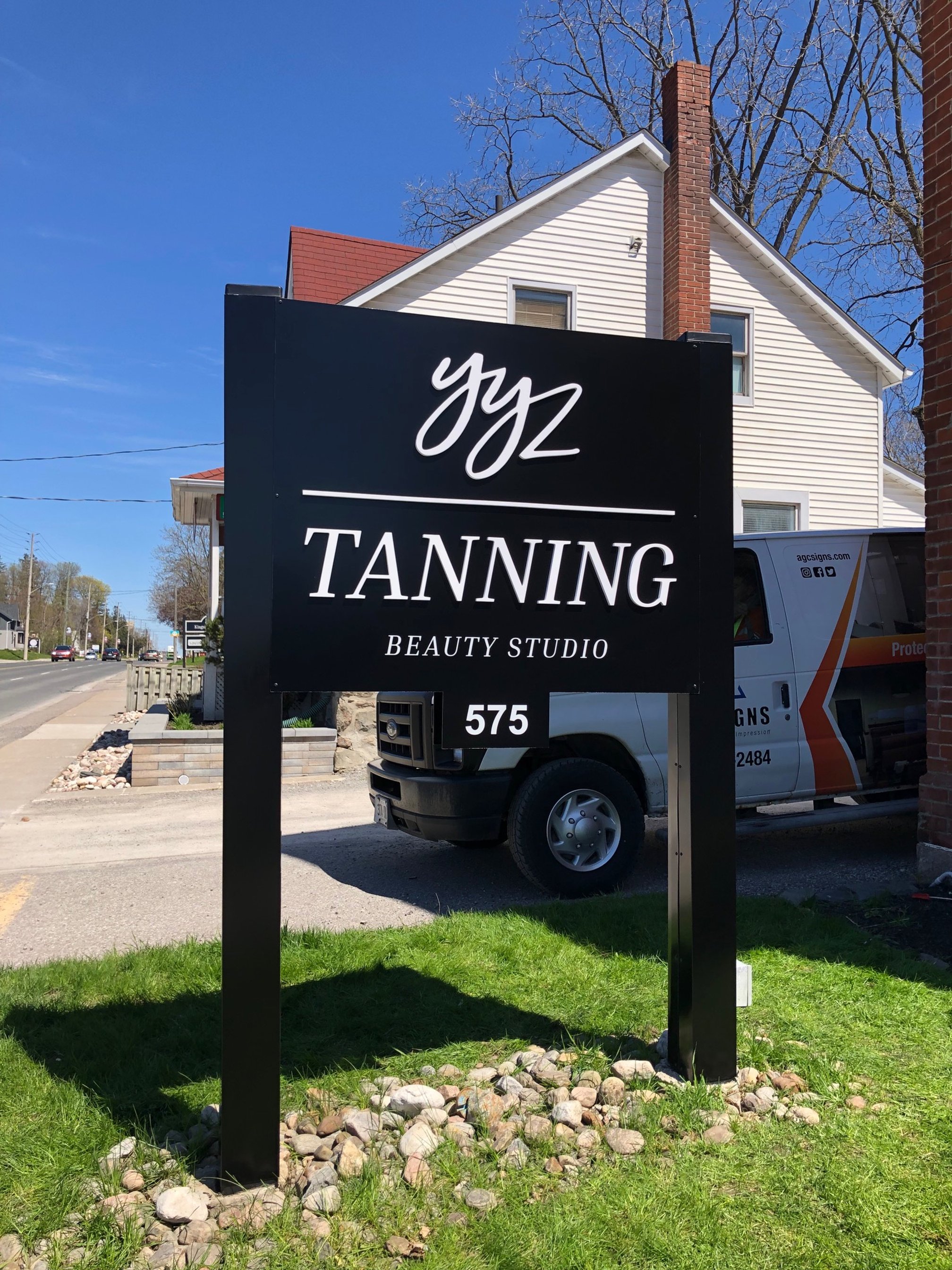
Example #3 - Physical Design

The actual shape and outline of your sign also matter when it comes to design.
Try to choose materials for the frame of your sign that complement the graphics you’ve chosen.
For example, the sign in this picture uses concrete on the top and bottom to act as a border, bracketing the more important words in the middle.
Communicating the right Info
When considering graphic design for signs, the aesthetics of the graphics can’t get in the way of the sign actually communicating helpful information to your customer. A sign that looks great but doesn’t say anything is useless.
At a minimum, a business sign should communicate the name or logo of the business, but can also include an address, slogan, hours of operation, or contact information.
Example #1 - Clear & Simple
Don’t overcrowd the info on your sign if you don’t have to.
Using contrast, like white text on black background, help make your business name stand out
If you know you won’t have to communicate news or updates through your signage, consider a simple graphical approach.
Example #2 - Digital Displays

In some specific cases, it may be worth adding more text than normal to your sign, like if you’re a school or community centre.
If you want a way to provide periodic updates to your clients, members, or students, consider a digital sign. They can be programmed to say whatever you like, and they can be updated as needed.
Practical Considerations
Finally, remember to not overlook practical considerations inherent with installing a physical sign.
These examples aren’t technically graphic design, but they are related, in that they allow the graphic design decisions you’ve already made to be properly appreciated by the public.
Example #1 - Nighttime Visibility

If you live in a colder climate where the days get shorter in the winter, or your local region often has rain or blizzards, a sign with electric backlit letters may be essential.
Combining light-up letters with bold colours helps customers find you no matter the conditions.
Example #2 - Adequate Height

Some signs, like pylon signs, are often built roadside so that people can see the sign as they drive by.
If your sign needs to be visible above traffic, or perhaps needs to rise above surrounding vegetation, ask your local custom sign shop about installing a tall, obvious sign.
AGC - SIGNS THAT MAKE AN IMPRESSION

Central Custom sign company
For custom signs, pylon signs, electric signs, and much more, contact AGC Signs today for specific project details or even a free quote.
“Adrian and his team are very professional, reliable and easy to work with. AGC has made two signs for me already for two different store fronts. I love both of them! Highly recommended!”
“...They updated our existing signage and installed new signs and understood our branding requirements and vision from beginning to end! Excellent turn around time, professional crew and great communication. We are extremely pleased with our new look and I definitely recommend AGC to any business looking to upgrade their signage, and we will definitely use them again for future projects. Thanks guys!”


