Minimalism is not merely a design trend—it is a powerful, strategic statement. In a world of increasing visual noise, the 2025 signage landscape has definitively crowned simplicity as the ultimate form of sophistication, visibility, and brand confidence.
Cluttered, over-designed signs are fading into obsolescence, unable to compete with the sheer communicative power of clean lines, intentional negative space, and refined typography. This is how the "less is more" philosophy has not only permeated but dominated the modern sign design conversation.
Contact us today to start planning your new interactive sign project.
Key Takeaways
Minimalism is Strategic: It's a deliberate choice to use visual restraint to convey premium quality and confidence.
Clarity = Visibility: Clean fonts and high-contrast colours ensure the core message is legible, even in high-traffic environments.
Negative Space is Not Empty: The intentional use of open space is a sophisticated design element that enhances focus and reduces cognitive load.
Function Follows Form: The aesthetic appeal of minimalist signage directly translates into superior readability and stronger, more positive brand perception.
1. The Minimalist Manifesto: Design as Strategic Restraint

The assertion that the modern consumer is "hyper-aware" is rooted in the psychological phenomenon of cognitive overload.
Every hour, consumers are bombarded with advertising, digital notifications, and visual stimuli—a sensory environment where most information is instantly filtered out as noise.
Modern sign design in 2025 is successful precisely because it understands this filtering mechanism. Instead of competing on volume (the "shouting" method), minimalist signage adopts a strategy of deliberate, welcome contrast.
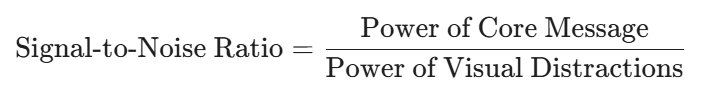
Cognitive Load and Signal-to-Noise Ratio
In information theory, readability and visibility are measured by the signal-to-noise ratio.
Cluttered Signage (Low Signal-to-Noise): Excessive fonts, colours, graphics, and text create a high "noise" level. The consumer's brain must expend significant energy (high cognitive load) to separate the core message ("signal") from the surrounding distraction. This effort often leads to the sign being ignored entirely.
Minimalist Signage (High Signal-to-Noise): By implementing extreme restraint—using only one font, one core colour, and ample negative space—the "noise" is eliminated. The core message is presented instantly, requiring minimal cognitive effort. This "clear whisper" cuts through the surrounding visual chaos and registers immediately.
Strategic Restraint: Shifting Brand Perception
This strategic restraint is what transforms the design from a simple aesthetic choice into a powerful branding tool:
Conveying Confidence: A business that uses a minimal sign appears self-assured. It implies that their product or service quality is high enough that they don't need excessive flash or persuasion. This immediately conveys premium quality and trustworthiness.
Focus on Value: By allowing the core message (e.g., the brand name, the product category, the primary service) to "shine without distraction," the brand elevates the importance of that information. It implies focus and specialization, boosting the perception of sophistication.
Enhanced Brand Recall: The simplicity makes the sign highly distinct and easy to memorize. In a sea of complicated logos and busy advertisements, the clean, memorable design embeds itself more quickly into the consumer's memory, translating directly to improved brand recall and a more professional image.
Essentially, simplicity in signage design is a direct acknowledgment of the consumer's limited attention span and a respectful use of their cognitive resources.
2. The Essential Elements of 2025 Minimalist Signage
The success of sign design trends 2025 is built on three core, intentional components:
Clean Typography: The Voice of Clarity
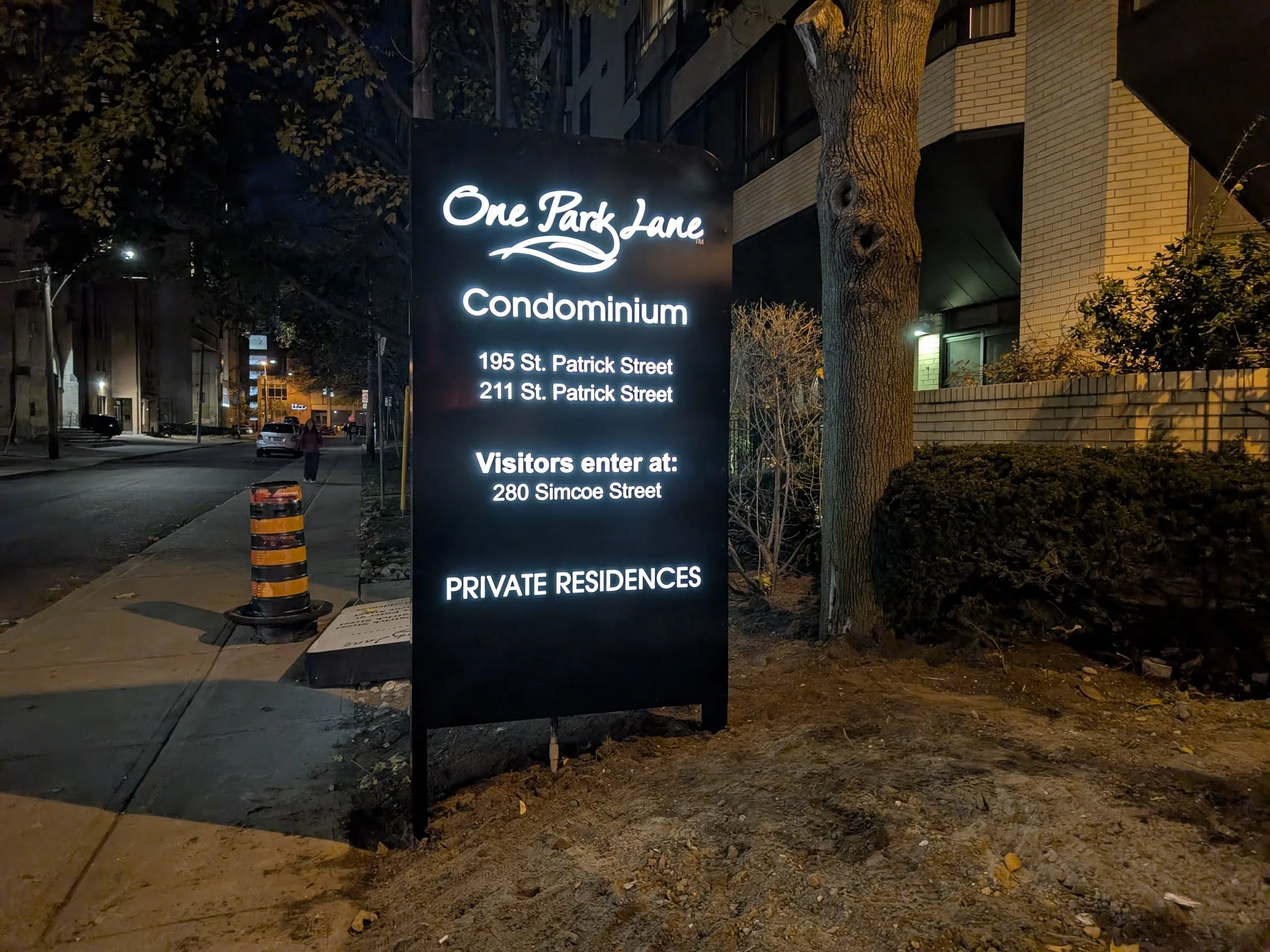
In minimalist design, the font does the heavy lifting. The trend favours geometric sans-serif typefaces—like a refined Helvetica or a bold, structured Gotham—which are inherently legible, even at speed.
Focus: Oversized, bold lettering used as a single focal point, ensuring the business name is readable from a distance.
Materiality: Fonts are often rendered as 3D-dimensional channel letters, matte-black painted aluminum, or sleek, backlit acrylic, adding depth without adding visual clutter.
Neutral Colour Palettes: The Foundation of Elegance
Clashing colours and gradients are out. Minimalist signs embrace high-contrast, limited palettes that ensure maximum readability and a timeless aesthetic.
Core Palettes: Monochrome (Black, White, and various shades of Grey), or a sophisticated pairing of two colours, such as matte black on white marble or brushed aluminum on a dark wood grain.
Accent Use: A single, strategic pop of colour, often an LED accent light or a subtle brand colour, is used only to direct the eye or highlight an icon, not to overwhelm.
Intentional Layouts: The Power of Negative Space
The proper use of "white space" (or negative space) is the defining characteristic of effective minimalist signage. This space is not empty; it is a design element that frames and emphasizes the message.
Enhancing Focus: Generous negative space surrounding the text reduces cognitive load, allowing the viewer's eye to process the message instantly.
Premium Feel: Ample open space signals confidence and quality—a distinct advantage for luxury brands, corporate offices, and high-end retail.
3. Case Studies in Simplicity: Brand Perception & Readability
Leading brands are actively shifting toward minimalist signage to cut through the visual noise and reinforce a message of modernity and efficiency.
| Brand/Project Type | Minimalist Strategy | Brand Perception Impact | Readability Improvement |
|---|---|---|---|
| Major Tech Retailers (e.g., Apple Stores) | Simple, single-word logo in white or metal on a clean, glass facade. | Sophistication & Exclusivity. Positions the brand as a leader focused on product, not flashy promotion. | Instant Recognition. The high-contrast wordmark is unmistakable from great distances. |
| Boutique Coffee Shops (Local Projects) | A single, hand-painted black or neon-flex wordmark, often on a natural wood or exposed brick wall. | Authenticity & Craftsmanship. Evokes a sense of care and high-quality artisanal product. | Clarity on Foot. Easy to read up close, drawing passersby in with an understated invitation. |
| Corporate Wayfinding | Thin, high-contrast sans-serif on frosted acrylic or brushed aluminum directional plaques. | Professionalism & Order. Reduces visitor anxiety by clearly guiding them without visual distractions. | Efficiency. Message is processed instantly, which is critical for navigation in complex spaces. |
The uncluttered, intentional aesthetic of modern sign design in 2025 improves the experience for the user and the bottom line for the brand. Simplicity is not just beautiful; it is highly functional, delivering a powerful message that resonates longer and clearer than its maximalist predecessors.
Time to Embrace Clarity
In the saturated visual market of 2025, your sign is more than an identifier—it is your most visible and potent branding asset. The data is definitive: simplicity is the new competitive edge. Clutter is costly, diminishing both readability and professional stature.
Ready to elevate your visibility and refine your brand image? Assess your current signage against the principles of 2025 minimalist design.
Audit: Are your fonts clean? Is your colour palette neutral and high-contrast?
Simplify: Identify and eliminate every element that does not serve the core message.
Take the first step toward visual mastery. Consult with a design specialist today to translate the power of minimalism into a striking, unforgettable sign for your business.
Don't wait to start your next great project! Contact AGC Signs today.
“We had a great experience working with Adrian from AGC Signs! From design plan to installation, their team was professional, responsive, and wonderful to work with. The final product exceeded our expectations—we’re so happy with the results. Highly recommend them for any signage needs!”


